Please Note This forum exists for community support for the Mango product family and the Radix IoT Platform. Although Radix IoT employees participate in this forum from time to time, there is no guarantee of a response to anything posted here, nor can Radix IoT, LLC guarantee the accuracy of any information expressed or conveyed. Specific project questions from customers with active support contracts are asked to send requests to support@radixiot.com.
Graph with 15Min consumption from electricity meter with absolute value
-
As I'm now importing my XML's I'm now creating dashboard's for the various Location's I'm AMR'ing. Nearly all those Energy-Meter's are read by MBus and deliver their meter reading as an absolut value continouesly growing...
I've created a watch list following this
But my graph looks like this by default:
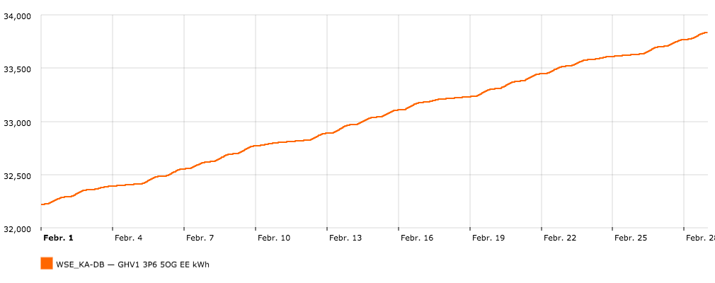
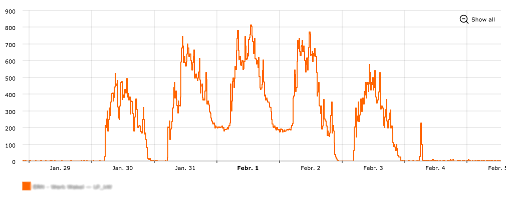
What I need instead is a chart like this
To achieve this every value needs to subtracted from the prior timestamp's value. But I didn't find any example where this was mentioned. I know it was mentioned in one of the demo video's but can't remember which...
-
Use the date bar controls on the toolbar to select a 15 minute delta rollup.
If you have various points you need displayed differently then you can set the type of rollup per point on the data point edit page (legacy UI data sources page) then select point default from the date bar.
-
@jared-wiltshire said in Graph with 15Min consumption from electricity meter with absolute value:
Use the date bar controls on the toolbar to select a 15 minute delta rollup.
If you have various points you need displayed differently then you can set the type of rollup per point on the data point edit page (legacy UI data sources page) then select point default from the date bar.
Hi Jared,
sorry but I don't get it right... I've just started using Mango so I'm not yet that fluent in the GUI Acronyms...
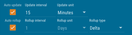
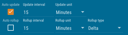
I got that the date bar is always on top and this is what I did set:
But the Chart is not update'd and still show's the daily rollup:
I also tried to find your setting on the legacy UI, but I didn't come closer then opening the data sources page...
EDIT: just realized that it's showing the daily because it's set to do so, but the Rollup Interval is "greyed out" so I can't change that! I even tried with an hourly rollup, but it's not changing with that setting...
Argghh: Got it just removing the check enables it :-(
-
@Jared-Wiltshire I want to create dashboard's for several energy-site's. Each with an overview chart in 15Min Delta Rollup, a pie to show the diversification between the different meters and some stat's. But I can't find an example that describe's this with fixed data point's...
I don't want a picker or a list for that. I want the dashboard available to the client. So they shouldn't have an option to change the data-source or data-point used on the dashboard.
Can you please give me an specific example for this demand?
And is the code off that "Energy Campus Example" available somewhere public? I read about it in two postings and saw the video but can't find anything specific...
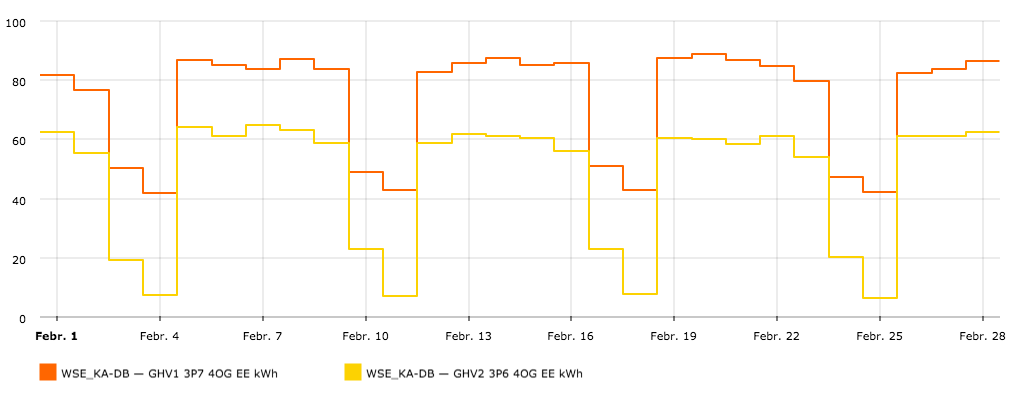
EDIT: played with the chart examples and found a way to fix it to delta and 15 Minutes:
rollup="DELTA" rollup-interval="15 MINUTES"But I still need figure out how to pre define data-point's for a chart
EDIT2: in the <ma-point-values> Doc point-xid is mentioned but looking in the legacy UI / data-point's I can't find that string. All I see is "Export Id (XID):", is that the same and just not consistently named?... And even if I found it how would I define that to let's say "point1"?
EDIT3: <ma-get-point-value> is my solution:
<div id="87c617bf-e3be-4e9c-9e66-b5ea619899e8" style="position: absolute; left: 1px; top: 2px; width: 769px; height: 34px; text-align: center;">WSE KA-DB</div>
<ma-get-point-value point="point1" point-xid="GHV1 3P6 5OG EE kWh"></ma-get-point-value>
<ma-get-point-value point="point2" point-xid="GHV1 3P7 4OG EE kWh"></ma-get-point-value>

<ma-point-values point="point1" values="point1Values" from="dateBar.from" to="dateBar.to" rollup="DELTA" rollup-interval="15 MINUTES">
</ma-point-values>
<ma-point-values point="point2" values="point2Values" from="dateBar.from" to="dateBar.to" rollup="DELTA" rollup-interval="15 MINUTES">
</ma-point-values>

<ma-serial-chart style="height: 300px; width: 100%" series-1-values="point1Values" series-1-point="point1" series-2-values="point2Values" series-2-point="point2" series-2-axis="right" legend="true" balloon="true" options="{valueAxes:[{minimum:0, axisColor:point1Color, color:point1Color}, {axisColor:point2Color, color:point2Color}]}">
</ma-serial-chart>
Still looking for an example for the pie... ;-)
-
Hi Mircsicz
I needed to accomplish a similar UI with flow meter totalizers. These 2 videos should help you with navigating the legacy UI for data points and getting the delta roll up you trying to accomplish.
Hello! It looks like you're interested in this conversation, but you don't have an account yet.
Getting fed up of having to scroll through the same posts each visit? When you register for an account, you'll always come back to exactly where you were before, and choose to be notified of new replies (either via email, or push notification). You'll also be able to save bookmarks and upvote posts to show your appreciation to other community members.
With your input, this post could be even better 💗
Register Login